Contents
Why does there need to be a V3
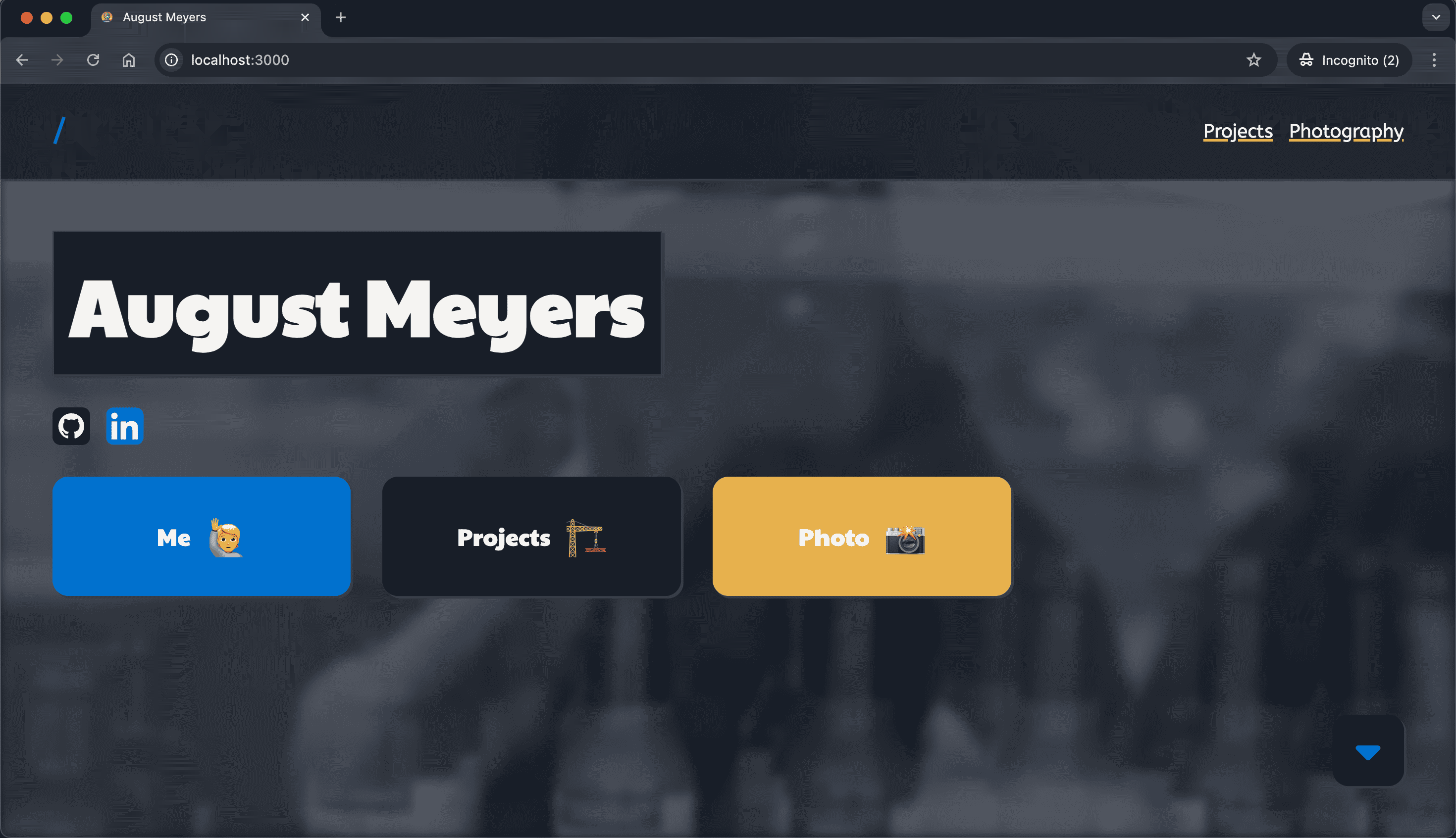
Simple. The current site, v2, was not up to par with my current skill level and the information was mostly outdated. Also, I was a little ashamed to include the link on my LinkedIn or Resume since it was a little ugly looking back...
The iterations of portfolio sites began with version 1 to show off my experience and knowledge without just uploading my Resume PDF online. From the beginning, it was hosted on the domain meyersa.com and on my own servers, which was pretty impressive for a freshman in college at the time.
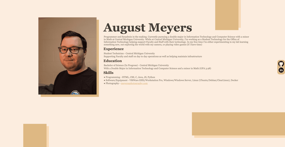
Over time this iteration of the site began to have more downfalls, making it apparent that a new site was needed. Since it was one of the first web projects I had ever worked on, it was not mobile-friendly and broke often on new displays. Don't get me wrong, it did not have any px values, it just was not very well thought out. Abstract ideas like blocks floating on the page just did not make enough sense to work without Javascript, and frankly, image centering and manipulation without Flex boxes made it quite atrocious. To combat this, a v2 was implemented with some more modern ideologies, but still without JavaScript to keep things simple.
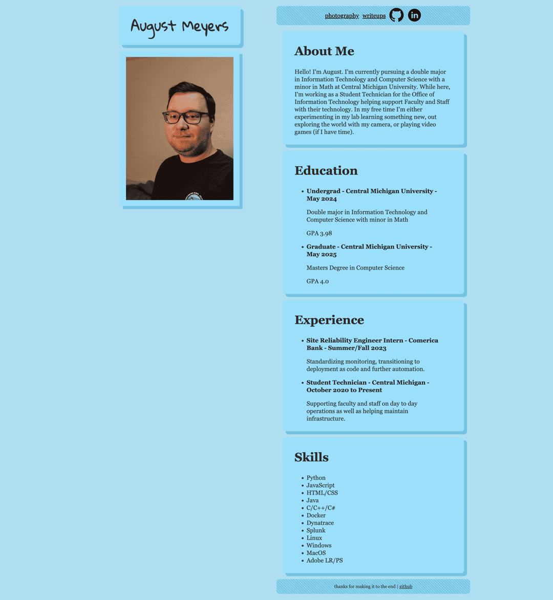
The second iteration highlighted a new issue: being too basic. While it was more mobile-friendly, utilized better standards, and looked a little better - it still sucked. There was no pop, and honestly, it was distracting how blue it was. A more professional and thought-out website had to be built. Which is where v3 comes in.
Vision
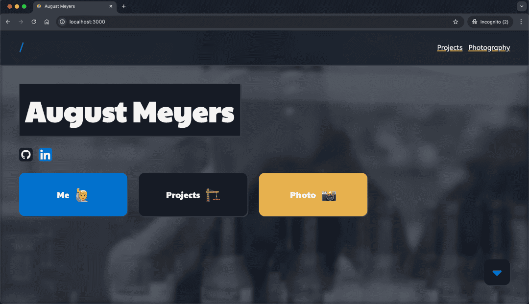
The new iteration was going to come with some big changes to address most of the issues I had with the original site as well as some other goals I had in mind.
Making it More Complex
While simple is usually better, vanilla HTML and CSS were not cutting it. This time it would be on React utilizing the NextJS framework. This would provide the customizability and reusability that I had loved working on InstitutionPenguin.
Aggregating
At this point, there were two other sites, writeups.meyersa.com (defunct) and photography.meyersa.com (defunct) that were running. But they were equally too small to be their projects. Just like the portfolio on its own was too small. The new site would combine all three into one site that served a greater purpose.
Looks
This time it would be mocked up before implementation and be planned ahead of time. Also catering to the photography portfolio, a viewer would be needed to ensure things looked better - a limitation of the previous WordPress site.
Implementation
While there were a lot of moving parts with this, some of the main ones to consider are the React implementation, a custom photo viewer, and markdown parsing. Anything else would make this too long of a read.
React
Instead of implementing React Native and considering a router to use with it, NextJS has had my attention for a while. I've used it in some other larger projects, and it works well when things get complicated. Under the hood, it's just a wrapper for React and it uses the same ideologies with some web-focused improvements.
For example, NextJS allows for page templating, which can be used for dynamic entries like the projects directory on this site.
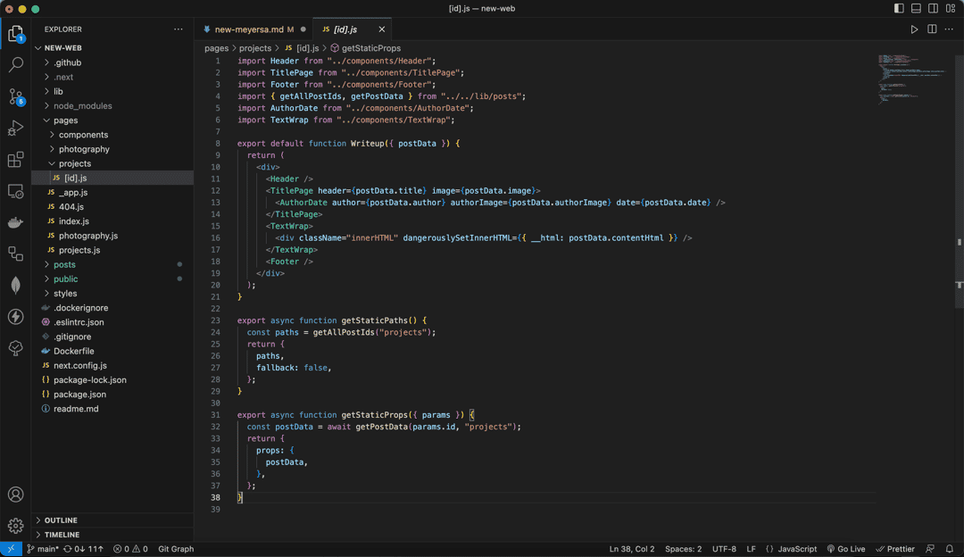
With the template, site content can be fetched from a local function, cached, and displayed to all visitors. Components can also be imported and used to display content - another great feature of React. In this instance, a component that I created, TitlePage, is rendering with information passed in from the Markdown files, such as the name and picture. In this component, I can then reference these inputs and use them to render content.
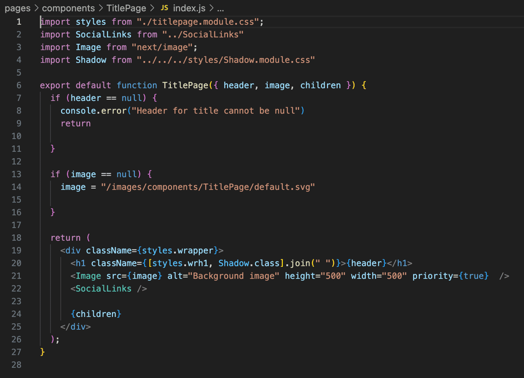
There is nothing more satisfying than defining something once and then using it everywhere.
Photo Viewer
On the Photography side of the website, images can be clicked on and viewed with more information in a less distracting setting.
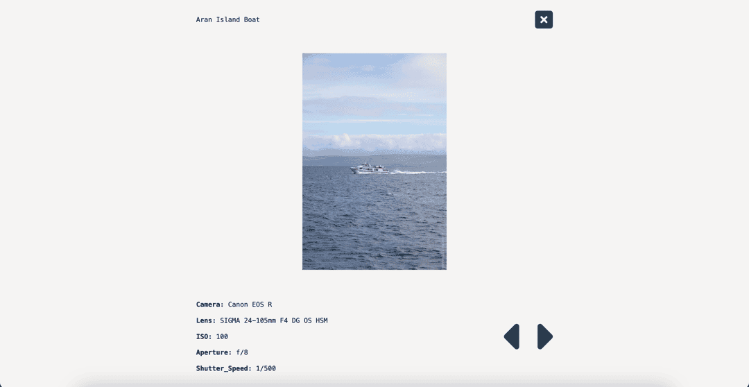
This was something I had always wanted to implement on the Wordpress implementation of my photography portfolio but never did due to the complexity of Wordpress plugins. With NextJS, things were different, it was an easy and approachable JavaScript task.
The only challenge was popping an image out of its position on the page and making it interactable. Normal approaches would be to just absolute position it and overlay it on top - but in this case, overflow had been hidden to keep the images in a sliding display, making it impossible to pop out the original element.
Luckily, there's another way: search parameters and react hooks.
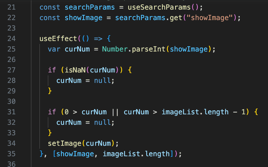
By adding a query like the image number to the URI, a listener in a separate element can react by popping up the viewer. This eliminates any problems with overflow and even simplifies the process. Furthermore, any changes to the viewer like closing it and moving to another element, can be easily implemented by just changing the value in the query - something that would have been much more complicated otherwise.
Markdown Parser
To generate Dynamic content, the go-to solution is markdown. Instead of having a giant JSON that would be stupidly complicated to write every time or making the page for each article, markdown allows a way to just write a page normally and then parse it later into a web page. This takes care of all formatting like h1, p, images, etc., and leaves that to predefined styling - amazing.
Parsing markdown with NextJS is pretty common, it's even featured in their documentation. However, as always, it's not that simple, and what I wanted to do was slightly different than what they wanted to do. Luckily, the frameworks that I used - remark and rehype, are platform agnostic and had their own documentation and I was able to figure out a way to parse just how I wanted - preserving images and even adding alt text to them later as seen in this post.
Conclusion
For the most part, this project has been wrapped up, but it never will really end. There are so many things I want to implement and there will be posts and styling changes coming with time. But importantly, now that it is on a real platform, these changes can be made without restarting the project and it will grow over time.
Technologies
- React/NextJS
- GitHub Actions CI/CD
- Docker
- JavaScript
- gray-matter
- remark
- swiper
